Fields
Fields are the building blocs of the module. They are the inputs that the user will fill in to customize the product.
Each field can have a name, a label and a type basically.
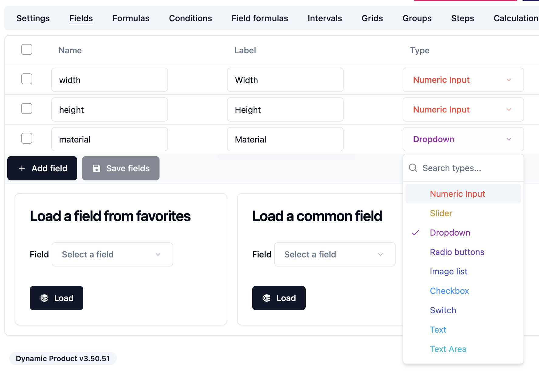
The name allows the module to reference the field in the formula. The label is the text that will be displayed to the user. You can configure a label for each language of your shop.
The module supports many types of fields:
- Numeric Input
- Slider
- Dropdown
- Radio buttons
- Image list
- Checkbox
- Switch
- Text
- Text Area
- Date
- Image
- File
- Fixed Value
- Price
- Dynamic Variable
- Feature
- Divider
- Color picker
- Html
- Error message
- Custom field
- Preview field
- Country
Each field type has its own settings. Some fields also have options such as the dropdown field or the radio buttons fields.
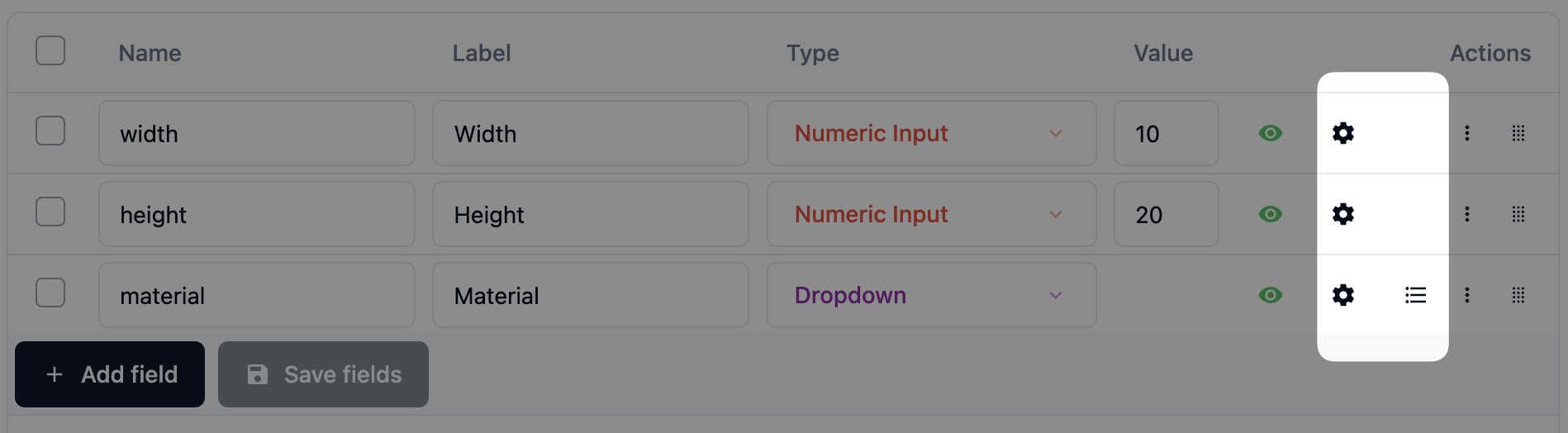
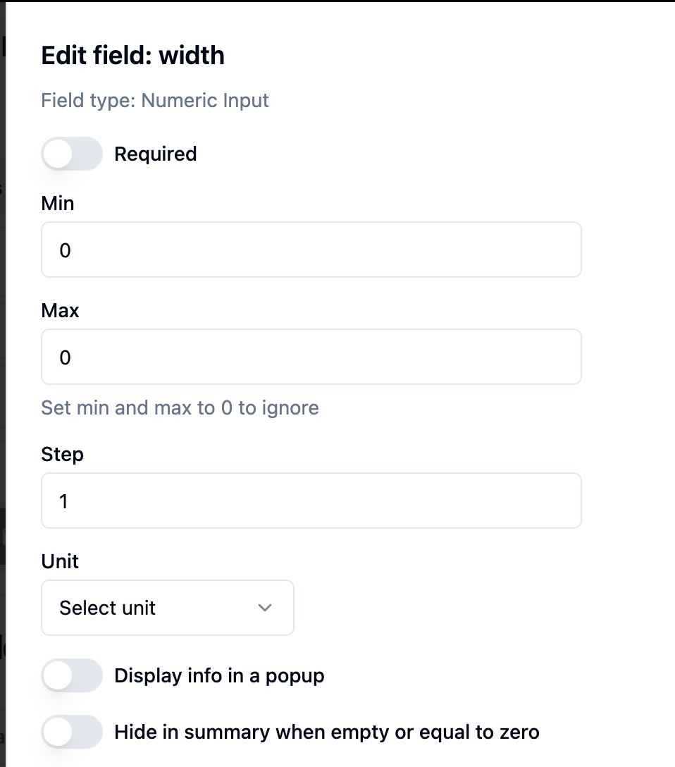
Field settings
Here's how the field settings of a Numeric input look like:
Field options
Here's how the field options of a Dropdown field look like:
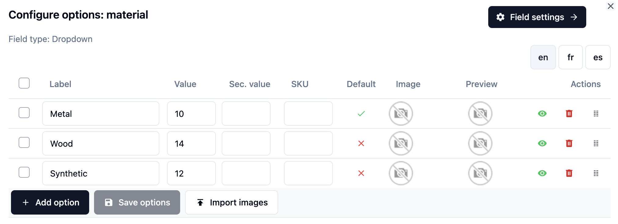
Each option can have a value and a secondary value.
When you reference the field in a formula, the field name will be replaced by the value of the selected option.
Example:
If the customer selects the Wood option in the material field above, and you have this price formula
[material] * 2then the formula will be evaluated as
14 * 2Here's another example with a width and a height field:
[width] * [height] * [material]So the meter square cost will depend on the selected material.
You can also reference the secondary value of the selected option by using double brackets like this:
[[material]] * 2